
Website Mistakes That Cost Businesses Customers
Your website may not be losing customers because your business is bad.
It may be losing customers because the website is making people work too hard.
A visitor lands on your page. They do not immediately understand what you do. The page loads slowly. The service description is vague. The WhatsApp button is hidden. The pricing or process is unclear. The photos look generic. There are no reviews, no location signals, no proof, and no strong reason to trust you.
So they leave.
This happens every day to restaurants, salons, real estate agents, consultants, clinics, schools, boutiques, construction companies, agencies, coaches, and local service providers. The business may be capable, but the website creates friction before the customer feels confident enough to call, book, buy, or message.
Google’s SEO Starter Guide explains that helpful, reliable content and clear organization help search engines and users understand a website. That same principle applies to conversion: if people cannot understand your business quickly, they are unlikely to become customers.
1. Your Homepage Does Not Say What You Actually Do
One of the most expensive website mistakes is a vague homepage.
Many businesses open with phrases like:
We provide quality solutions for your needs.
Your trusted partner for excellence.
Transforming businesses through innovation.
These statements sound professional, but they do not answer the visitor’s real question:
Can this business solve my specific problem?
A stronger homepage headline says exactly what you do, who you serve, and why it matters.
For example:
Website Design and SEO for Small Businesses in Cameroon
Private Catering for Corporate Events in Douala
WhatsApp CRM Setup for Growing African SMEs
Affordable Accounting Support for Startups and Small Businesses
Your homepage should pass the “so what?” test. After reading your main headline, a visitor should not need to ask, “So what does this company actually do?”
2. Your Website Is Too Slow

Speed affects trust.
When a website takes too long to load, customers assume the business is outdated, disorganized, or unreliable. This is especially important in markets where many users browse on mobile data, slower networks, or older devices.
Google’s PageSpeed Insights measures page performance on mobile and desktop and provides suggestions for improvement. Google’s documentation explains that PageSpeed Insights uses both lab and real-world data where available, which makes it useful for identifying performance issues that may affect user experience.
Common causes of slow websites include:
- oversized images
- cheap or overloaded hosting
- too many plugins
- heavy sliders
- uncompressed videos
- poor mobile optimization
- bloated themes
- unnecessary scripts
A fast website does not need to be plain. It needs to be disciplined. Compress images, remove unnecessary effects, use reliable hosting, reduce plugin clutter, and test your most important pages regularly.
3. Your Website Looks Good but Is Hard to Use
Beautiful design is not the same as good user experience.
A website can have nice colors, animations, and photos while still confusing visitors. If people cannot find services, pricing guidance, contact buttons, opening hours, locations, or next steps, the design is failing.
Good UX answers practical questions quickly:
Where am I?
What does this business offer?
Who is this for?
What should I do next?
Can I trust them?
How do I contact them?
Google’s guidance on page experience makes an important point: good page experience is broader than technical scores alone. A useful page must support the user’s goal, not merely pass a tool test.
For small businesses, strong UX often means simple navigation, clear sections, readable text, visible contact options, helpful service pages, and fewer distractions.
4. Your Website Is Weak on Mobile

Most customers will not study your website calmly on a desktop computer.
They will open it on a phone, often while multitasking, comparing options, or deciding whether to message you. If your mobile site is hard to read, slow to load, or difficult to navigate, you lose serious customers.
Mobile mistakes include:
- tiny text
- buttons too close together
- images that break the layout
- menus that are hard to open
- forms that are too long
- WhatsApp buttons hidden at the bottom
- popups blocking the screen
- pages that require too much zooming
Your mobile homepage should answer the main customer question within seconds. The visitor should be able to scroll, understand, and contact you without frustration.
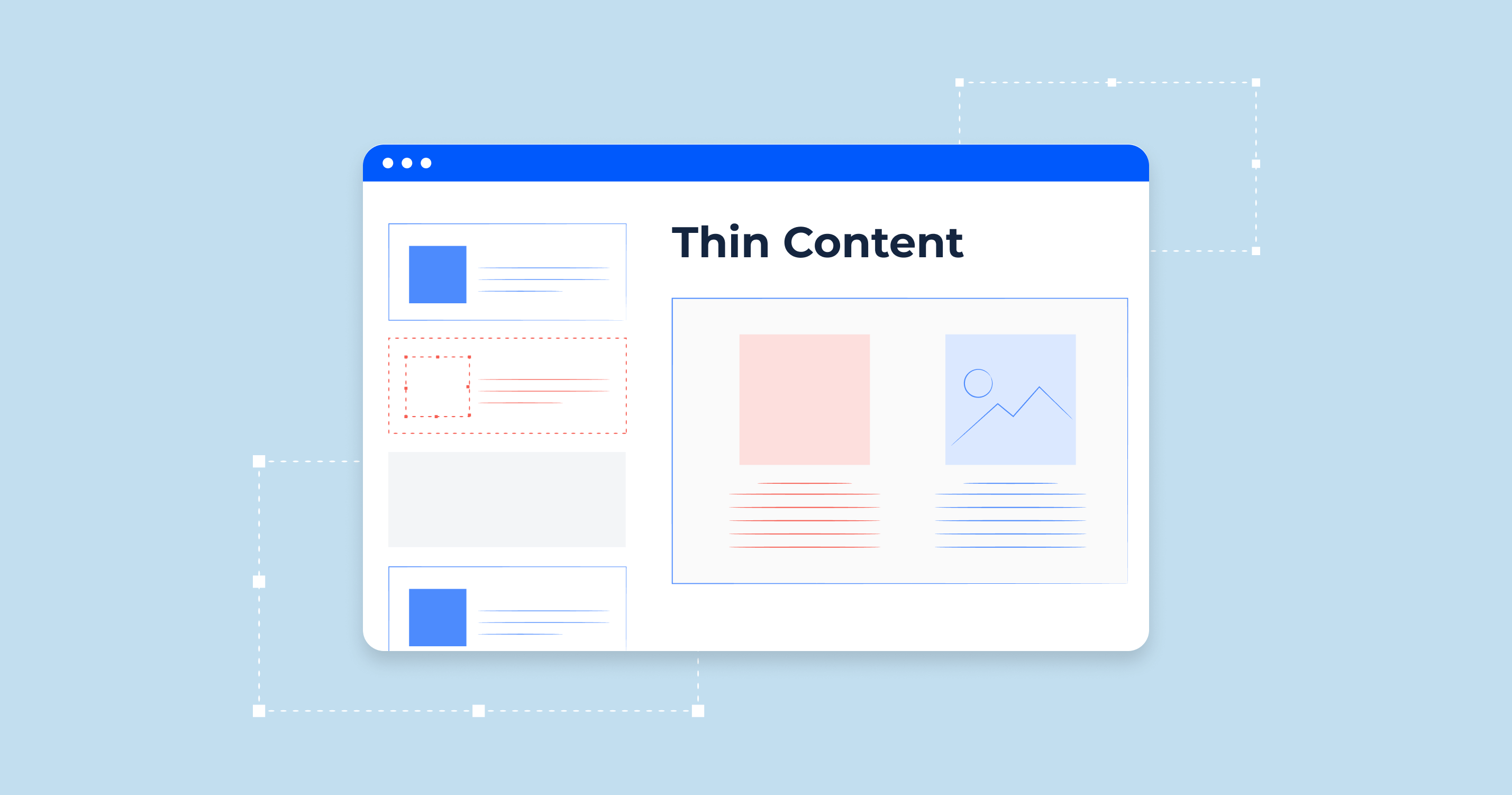
5. Your SEO Is Too Thin
A website cannot convert customers who never find it.
Many business websites have only a homepage, about page, contact page, and one vague services page. That is usually not enough for SEO, especially if customers search for specific services, locations, costs, comparisons, and questions.
Google’s Search Essentials explains the core requirements for content to be eligible to appear and perform in Google Search. Your website needs to be crawlable, useful, and understandable if you want organic traffic.
Instead of one page called “Services,” create specific pages such as:
- Website Design for Small Businesses
- SEO Services in Cameroon
- Catering for Corporate Events
- Real Estate Valuation Services
- Accounting for Small Businesses
- Digital Marketing for Restaurants
- Wedding Photography in Douala
Each page should explain the service, who it is for, problems solved, process, proof, FAQs, and next step.
Search engines need clarity. Customers do too.
6. You Hide the Contact Button
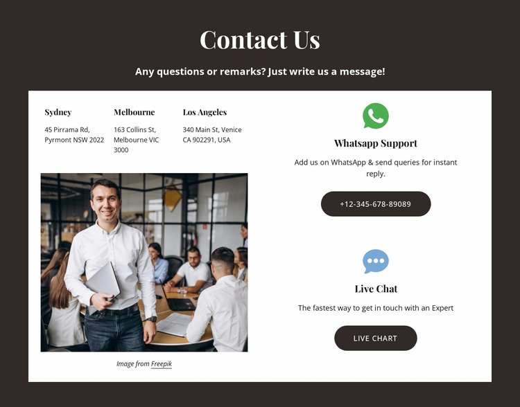
Some websites make customers search too hard for contact details.
That is a conversion killer.
If your business depends on calls, WhatsApp messages, bookings, consultations, store visits, or quote requests, contact options should be obvious.
Use:
- a visible WhatsApp button
- clickable phone number
- contact form
- email address
- map link
- opening hours
- location or service area
- booking link where relevant
Do not force customers to “figure it out.” A serious buyer should never wonder how to reach you.
For local businesses, Google’s guidance on adding business details to Google also highlights the importance of accurate business information across Google Search and Maps. Your website should reinforce the same clarity: name, location, contact, and business identity should be consistent.
7. Your Copy Talks About Features, Not Outcomes
Customers do not buy features first. They buy outcomes.
A feature says:
We offer social media management.
A benefit says:
We help your restaurant turn Instagram attention into WhatsApp enquiries, table reservations, and repeat visits.
A feature says:
We provide website design.
A benefit says:
We build clear, fast websites that help customers understand your offer and contact you with confidence.
A feature says:
We offer accounting services.
A benefit says:
We help small businesses track cash flow, prepare records, and avoid financial confusion.
Use the feature-versus-benefit rewrite test:
Feature: What do you provide?
Benefit: Why should the customer care?
Business impact: What does this help them avoid, improve, save, earn, or achieve?
Your website copy should not only describe your business. It should help customers understand why your business matters to them.
8. You Have No Trust Signals
Trust is one of the biggest conversion factors, especially in markets where customers rely heavily on referrals, WhatsApp conversations, visible proof, and reputation.
A website with no trust signals feels risky.
Add proof such as:
- testimonials
- client logos
- project photos
- case studies
- before-and-after examples
- certifications
- team photos
- office address
- Google Business Profile link
- media mentions
- portfolio samples
- refund or guarantee details where appropriate
Trust signals should be specific. “We are trusted by many clients” is weaker than showing real reviews, named projects, client categories, measurable outcomes, or visible work samples.
9. Your Website Uses Generic Stock Photos
Generic stock photos can make a local business feel fake.
A restaurant should show real food. A salon should show real work. A school should show real facilities. A hotel should show real rooms. A construction company should show real projects. A consultant should show real workshops, events, or client contexts where appropriate.
Stock photos are not always wrong, but they should not replace evidence.
Customers want to know what they are actually buying. Real images reduce uncertainty. They also help differentiate your business from competitors using the same polished but empty visuals.
10. Your Forms Are Too Long
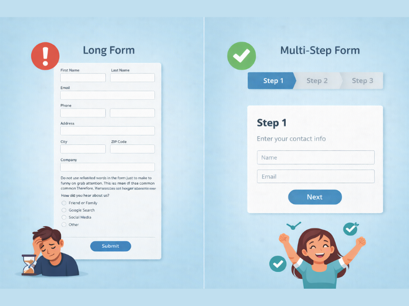
A contact form should match the customer’s stage of commitment.
A first-time visitor may not want to fill ten fields just to ask for a quote. Long forms create friction, especially on mobile.
Ask only what you need to respond well:
- name
- phone or email
- service needed
- short message
- preferred contact method
For complex services, use a longer form later in the sales process. The first conversion should be easy.
11. Your Website Has No Clear Next Step
Every important page should guide the visitor.
After reading, what should they do?
Call? Request a quote? Book a consultation? Send a WhatsApp message? Visit the store? Download a guide? View packages? Check availability?
Weak calls to action say:
Submit
Learn More
Contact Us
Stronger calls to action say:
Request a Website Quote
Book a Free Consultation
Ask About Catering Availability
Message Us on WhatsApp
Get the Price List
Schedule a Property Viewing
The more specific the action, the easier it is for the customer to move.
12. Your Website Does Not Match How Customers Actually Buy
Many websites are built like brochures, but customers buy through a process.
A customer may first search Google, visit your website, compare your services, check your Instagram, read reviews, message you on WhatsApp, ask about price, delay, return later, and finally decide.
Your website should support that journey.
For African SMEs, this often means connecting the website to WhatsApp, Google Maps, Instagram, testimonials, clear pricing guidance, service explanations, FAQs, and fast follow-up.
If your website ignores the way customers actually behave, it will look professional but convert poorly.
13. You Do Not Track What Visitors Do
You cannot improve what you do not measure.
At minimum, your business should use Google Search Console and Google Analytics or another analytics tool to understand traffic, search queries, popular pages, and conversion behavior.
Google says Search Console helps website owners understand how their site is performing in Google Search, while reports such as Core Web Vitals show performance based on real-world usage data.
Track:
- which pages get traffic
- which pages get enquiries
- which search terms bring visitors
- where users drop off
- which devices visitors use
- which pages are slow
- which calls to action get clicks
A website should improve every month, not remain untouched for years.
A Quick Website Fix Checklist
Start with the pages that matter most: homepage, main service pages, contact page, pricing or quote page, and highest-traffic blog posts.
Then fix these basics:
- Make the homepage headline specific.
- Compress large images.
- Test speed with PageSpeed Insights.
- Improve mobile readability.
- Add visible WhatsApp, phone, or booking buttons.
- Rewrite service copy around customer outcomes.
- Add testimonials or proof.
- Create specific service pages for SEO.
- Remove confusing navigation.
- Add FAQs that answer buying objections.
- Make forms shorter.
- Track search and conversion data.
You do not need to rebuild the whole website before improving results. Often, the first gains come from clarity, speed, trust, and contact visibility.
Your Website Should Make Buying Easier
A website is not just an online business card.
It is part of your sales system.
If it is slow, vague, confusing, invisible on Google, weak on mobile, or missing trust signals, it quietly costs your business customers every day.
But the fix is not always complicated. Say what you do clearly. Make pages fast. Help people navigate. Explain services properly. Show proof. Make contact easy. Build SEO around specific customer searches. Track what works. Improve consistently.
Customers are not looking for a perfect website. They are looking for a business they can understand, trust, and contact without friction.