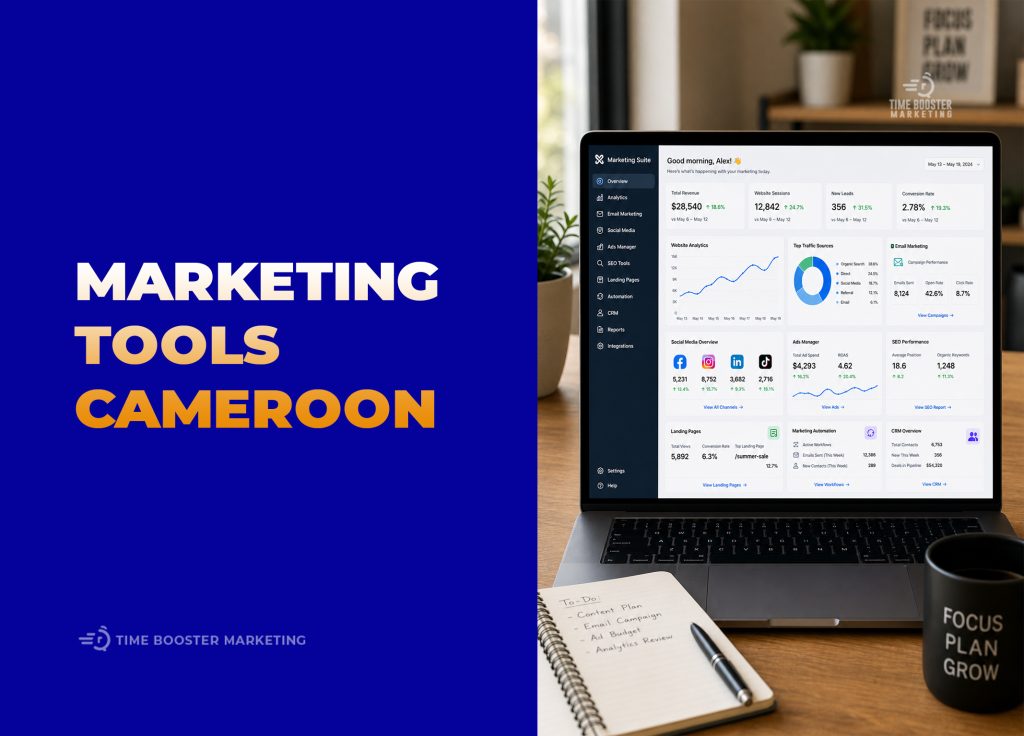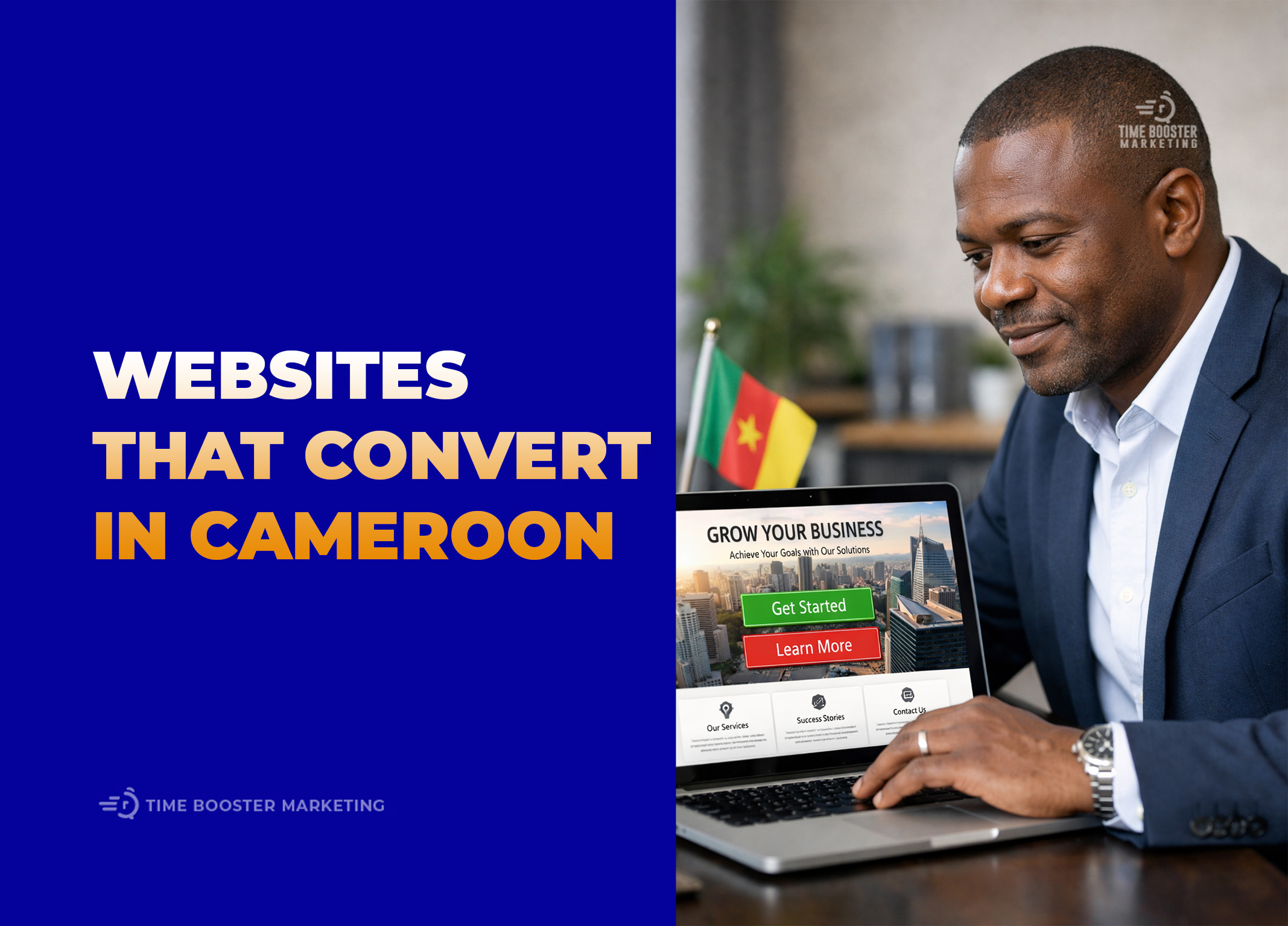
7 Best Website Designs in Cameroon That Convert
 1")
If your website is “beautiful” but doesn’t generate calls, WhatsApp messages, bookings, or orders… It’s basically interior decoration for the internet.
In Cameroon, conversion-focused design has its own rules:
- most visitors are on mobile
- attention spans are short (and data bundles aren’t free)
- trust matters a lot (people want to know you’re real, local, and reachable)
- WhatsApp is often the fastest path to a sale
Below are 7 high-converting website design styles commonly used by successful businesses operating in Cameroon (and what to copy from each). These aren’t “pretty trends”—they’re layouts built to move visitors toward a decision.
 2")
What “Converts” in Cameroon (quick definition)
A conversion is any action that moves revenue forward, such as:
- WhatsApp click-to-chat
- phone call tap
- quote request/consultation booking
- store order + payment initiation (MoMo/Orange Money)
- application/enrollment submission
Before you pick a style, make sure your site has these Cameroon conversion essentials:
Cameroon conversion essentials (steal this checklist)
- Mobile-first layout (thumb-friendly buttons, readable text)
- Fast load speed (optimize images; avoid heavy sliders)
- Sticky CTA: “Call” + “WhatsApp” visible on mobile
- Local trust: address, service areas (Douala/Yaoundé/Buea etc.), business hours, real photos, testimonials
- Clear pricing direction (even “starting from…” beats silence)
- Short forms (name + phone + need; everything else later)
- Bilingual support (at least key pages/CTAs in English + French if you serve both)
- Strong landing pages for ads (don’t dump paid traffic on a generic homepage)
Helpful benchmarks/tools:
- Test speed with Google PageSpeed Insights: https://pagespeed.web.dev/
- UX research patterns (gold standard): https://www.nngroup.com/
1) The “WhatsApp-First Service Business” Design (best for agencies, trades, consultants)
Goal: turn visitors into chats/calls quickly.
What makes it convert
- A bold hero section: what you do + where + outcome
- Two primary CTAs: WhatsApp and Call
- A simple service menu (3–6 services max on the homepage)
- Proof stacked early: reviews, client logos, before/after, certifications
Layout to copy
- Top bar: phone + WhatsApp + location
- Hero: “Professional [Service] in [City]” + 1-sentence benefit
- 3 quick trust blocks: “Same-day response / Transparent pricing / Local team”
- Services grid → each links to a dedicated service page
- Testimonials + FAQ + final CTA
Pro tip (local)
Add a “Request a Quote on WhatsApp” flow with buttons like:
- “I need pricing”
- “I need it this week”
- “I need advice first”
That reduces typing friction (and friction is where leads go to disappear).
2) The “One-Page Lead-Gen Landing Page” (best for paid ads + promotions)
Goal: convert a specific offer from Google/Facebook ads.
What makes it convert
- Message match (headline repeats the ad promise)
- One CTA repeated throughout (book, quote, register)
- Minimal navigation (don’t give people 12 exits)
- Social proof aligned to the offer
Layout to copy
- Headline + benefit + CTA
- “How it works” in 3 steps
- Pricing/packages (or “starting from…”)
- Testimonials
- FAQ (handle objections: timeline, payment, location)
- Final CTA + contact options
Pro tip (local)
If you run ads, build one landing page per service per city (even if the content is 70% similar). Local intent converts.
3) The “MoMo/Orange Money-Ready Ecommerce” Design (best for retail, fashion, beauty, electronics)
Goal: turn product browsing into orders with minimal drop-off.
What makes it convert
- Clean categories and strong search (people shop fast on mobile)
- Product pages with:
- clear price in FCFA
- delivery details (cities, timelines, fees)
- trust (returns, support, WhatsApp)
- Checkout that doesn’t feel like a government form
Layout to copy (product page)
- Product images (compressed, swipeable)
- Price + availability + delivery estimate
- “Order on WhatsApp” + “Checkout” buttons
- Reviews + FAQ
- Related products
Pro tip (local)
Offer two purchase paths:
- regular checkout
- WhatsApp-assisted checkout (many customers prefer confirmation before paying)
And make delivery info extremely clear. Uncertainty kills carts.
4) The “Local Directory / Listings” Design (best for real estate, rentals, cars, services marketplaces)
Goal: get inquiries on specific listings.
What makes it convert
- Filters that work (city, budget, type)
- Listing pages built for decision-making:
- real photos
- location clarity
- key details above the fold
- Fast “inquiry” actions: call/WhatsApp/book viewing
Layout to copy (listing page)
- Gallery + price + key specs at the top
- Map or area description (if exact map isn’t appropriate)
- “Book a visit” CTA
- Similar listings
- Agent/company trust section (photo, phone, WhatsApp)
Pro tip (local)
Many leads ask the same questions. Add quick answers:
- “Is it still available?”
- “What’s the neighborhood like?”
- “Any advance required?”
Put these in an FAQ on every listing.
5) The “Trust-First Professional Firm” Design (best for law firms, clinics, accounting, B2B)
Goal: reduce doubt and increase consultation bookings.
What makes it convert
- Professional visual tone (clean typography, restrained colors)
- Authority signals: credentials, affiliations, case studies, publications
- Strong clarity: “Who we help” and “What we solve” sections
- Booking workflow (schedule + confirmation)
Layout to copy
- Hero: problem + solution + book consultation
- “Practice areas / services” with short summaries
- Team section with real photos + credentials
- Case studies / success stories (anonymized if necessary)
- FAQ + contact
Pro tip (local)
Add location and logistics prominently:
- clinic address + parking notes
- consultation hours
- how appointments work (walk-in vs booking)
Because uncertainty = no-show.
6) The “Education / Training Enrollment Funnel” Design (best for schools, bootcamps, professional training)
Goal: convert interest into applications/enrollments.
What makes it convert
- Program pages that answer: outcomes, curriculum, duration, cost, schedule
- Clear next step: apply, speak to admissions, download syllabus
- Automated follow-up (email/WhatsApp) after form submission
Layout to copy (program page)
- Program promise (“Become a … in 12 weeks”)
- Outcomes + student work/results
- Curriculum modules (accordion)
- Tuition + payment options
- Testimonials
- Apply CTA + WhatsApp admissions CTA
Pro tip (local)
If you accept staged payments, say so clearly. Also, add downloadable PDFs lightly; mobile users often prefer a simple page first.
7) The “Quote-in-60-Seconds Logistics/Delivery” Design (best for logistics, courier, moving, B2B services)
Goal: turn urgent need into immediate quote requests.
What makes it convert
- A short quote widget on the homepage
- Clear service areas (cities + neighborhoods)
- Transparent process: pickup → tracking → delivery confirmation
- Trust: partner logos, SLA statements, reviews
Layout to copy
- Hero with quote form (pickup, drop-off, package size, phone)
- Service area list
- Pricing guidance (even ranges help)
- “How it works.”
- Reviews + business contact CTA
Pro tip (local)
Make it easy to share details via WhatsApp (auto-filled message: pickup/drop-off/size). Your best leads are often in a hurry.
Common conversion mistakes (that quietly burn your budget)
- No sticky WhatsApp/Call buttons on mobile
- Heavy homepage sliders that load slowly
- Forms with 10+ fields (your visitors will not finish that)
- No local proof (no address, no real photos, no testimonials)
- Generic copy (“We offer quality services”) instead of specific outcomes
- Sending ad traffic to the homepage instead of a focused landing page
Quick “Which design should I use?” guide
- You want more calls/chats fast → WhatsApp-first service design
- You run paid ads → one-page landing page
- You sell products → MoMo/OM-ready ecommerce
- You sell listings → directory/listings design
- You sell expertise → trust-first professional design
- You sell programs → enrollment funnel
- You sell speed/operations → quote-in-60-seconds logistics design
 3")
Next step
Pick one primary conversion for your homepage (usually WhatsApp or booking), then:
- Put it above the fold
- Repeat it after every major section
- Make it sticky on mobile
Conclusion
The best website designs in Cameroon are not the flashiest; they are the ones that align design decisions with local user behavior and conversion goals. Mobile‑first responsiveness, bilingual clarity, instant chat/payment channels, and AI‑driven personalization are the pillars that turn visitors into leads and leads into customers.
Start by auditing your current site, integrating one AI‑powered conversion feature, and measuring the impact. With each iteration, you’ll build a self‑optimizing digital asset that works for you 24/7, even while you sleep.