


Meta Instant Experience Tutorial: Build High-Conversion Native Landing Pages
A high-performing ad can still lose the sale between the click and the landing page.
The customer taps your product video, leaves the social platform, waits for a mobile webpage to load, closes a popup, and searches for the product shown in the ad. Every additional step creates an opportunity to abandon the journey.
Meta Instant Experiences reduce the first layer of that friction. They open as full-screen mobile experiences after a person taps an eligible ad and can work with single-image, video, carousel, and collection formats. Meta describes them as fast-loading, mobile-first environments that remain inside Facebook or Instagram until the user selects an external destination.
However, an Instant Experience should not become a crowded copy of your website. Its job is narrower:
- Continue the promise made by the advertisement.
- Help the shopper understand and compare the offer.
- Direct qualified interest to the correct checkout path.
How the Instant Experience Funnel Works
A conventional Meta e-commerce journey often looks like this:
Advertisement → external product page → cart → checkout
An Instant Experience inserts a native merchandising layer:
Advertisement → Instant Experience → product page → cart → checkout
The extra stage may appear counterintuitive. The advantage is that the shopper reaches an interactive, full-screen product environment without immediately waiting for an external webpage.
In a collection ad, the user typically sees a main image or video with supporting product images. Tapping the cover opens an Instant Experience where products can be explored before the shopper moves to the advertiser’s website or app.
This structure is especially useful when your advertisement creates interest in a category rather than one specific product. A fashion brand can introduce a seasonal collection. A furniture retailer can show a completed room before presenting individual pieces. A cosmetics brand can demonstrate a routine and then allow shoppers to select the relevant products.
Prepare the Commerce Foundation Before Building
Instant Experience cannot repair a weak product feed, confusing offer, or poor checkout.
Before opening Ads Manager, confirm that your catalog contains accurate product names, images, prices, availability, and destination links. A product shown inside Meta should lead to the exact matching product page, not the homepage or an unrelated category.
You should also have the Meta Pixel and relevant commerce events configured on the website. Meta provides standard events for actions such as viewing content, adding an item to a cart, initiating checkout, and completing a purchase.
Meta recommends using the Conversions API alongside the Pixel where appropriate because server-side event sharing can improve the reliability of measurement and provide a stronger connection between website activity and Meta’s optimization systems.
The native experience may load quickly, but the final product page and checkout still need to work well on mobile. Test payment options, shipping information, form fields, product availability, and page speed before spending money on the campaign.
Step 1: Design the Collection Ad as the Entry Point
The collection ad is not a miniature catalog. It is the visual doorway into the Instant Experience.
Meta’s collection format uses a main image or video followed by smaller product images. When someone taps the creative, the Instant Experience opens and allows further browsing.
Give the Cover Creative One Clear Job
The main visual should communicate the product category, customer outcome, or campaign concept immediately.
A weak cover tries to display every product at once. A stronger cover creates one reason to explore:
- “Build Your Complete Skincare Routine”
- “New Workwear for the Modern Professional”
- “Furnish a Small Living Room Without Wasting Space”
- “Shop Lightweight Styles for the Dry Season”
Use the same central promise in the ad copy, cover media, Instant Experience headline, and destination page. This message continuity reassures shoppers that each click is moving them towards the offer they selected.
Demonstrate the Product Before Displaying the Grid
A short video can show texture, movement, scale, installation, styling, or use. A still image should make the customer outcome understandable without requiring extensive explanation.
The supporting product tiles should be relevant to the cover. Do not promote office clothing in the main video and then populate the first product row with unrelated casual items simply because those products are available in the catalog.
Step 2: Choose the Right Instant Experience Structure
Meta provides templates as well as a custom builder. The appropriate structure depends on the role of the campaign.
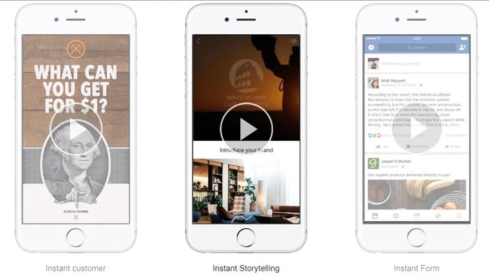
Meta positions Instant Storefront for browsing multiple catalog products, Instant Lookbook for combining brand storytelling with products, and Instant Customer Acquisition for encouraging a defined action on an external website or app.
Use a storefront structure when product discovery is the priority. Use a lookbook when context, styling, or demonstration increases desire. Choose a custom layout when the campaign requires a specific narrative or merchandising sequence.
Meta’s Instant Experience template guide and custom Instant Experience instructions explain the available creation paths. Feature availability and interface labels can differ by objective, campaign setup, and account.
Step 3: Build an Interactive Mobile Layout
A high-conversion Instant Experience should follow the shopper’s decision process rather than the order in which your assets were produced.
A practical layout contains five sections.
1. Hero Section
Begin with a strong image or short video that continues the advertisement’s promise.
Add one concise headline and a supporting sentence. The visitor should understand what is being offered before scrolling.
2. Value Section
Explain why the collection matters.
Focus on customer-relevant differentiators such as materials, availability, delivery terms, sizing, guarantees, local production, compatibility, or product performance. Avoid lengthy company history unless it directly reduces purchase anxiety.
3. Product Discovery Section
Present a tightly selected product group.
The first products should be the most relevant to the campaign, not automatically the newest or most expensive. Prioritize bestsellers, products featured in the cover creative, and items with reliable availability.
4. Trust Section
Use customer evidence, product demonstrations, short testimonials, guarantees, or delivery information to answer the concerns that could prevent the next click.
Keep this section visual. A mobile user should be able to scan it without reading several dense paragraphs.
5. Action Section
End with a clear next step such as:
- Shop the Collection
- View Product Details
- Choose Your Size
- Complete Your Set
- Check Availability
Meta’s builder allows advertisers to add and arrange different components inside a custom experience. The official component setup guide explains how components are added within the Instant Experience builder.
Step 4: Arrange Products Like a Merchandiser
A large catalog should not become one undifferentiated product grid.
Organize products around how customers shop.
Group Products by Buying Intent
Useful product groups include:
- Bestsellers
- New arrivals
- Products under a specific price
- Complete-the-look items
- Products for a specific problem
- Products for a particular occasion
- Starter products for first-time buyers
A skincare brand might begin with “Complete Routines,” followed by “Shop by Skin Concern.” A fashion retailer might separate workwear, weekend styles, and accessories. A home brand could organize products by room.
Meta’s Instant Storefront template is designed for catalogs with multiple products and can support organized product discovery before the shopper leaves the platform.
Control Choice Overload
Showing more products does not automatically produce more purchases.
Start with a focused set connected to the campaign concept. When every item has equal visual weight, the shopper must decide where to begin. When products are sequenced intentionally, the layout guides attention.
Place the strongest product or bundle first. Follow it with complementary options, alternatives at different price levels, and add-on products.
Maintain Product Consistency
The image, product title, price, promotion, and availability displayed in the experience should match the destination page.
A shopper who taps a black handbag should not land on a generic accessories page. A product advertised at a discounted price should not appear at full price during checkout unless the conditions were clearly disclosed.
Step 5: Create a Smooth Handoff to Web Checkout
The transition from Meta to your website is where many Instant Experience funnels fail.
Deep-Link to the Correct Product
Every product tile should open the corresponding product detail page. Campaign-level buttons should lead to the collection shown inside the experience, not the website homepage.
The fewer navigation decisions required after the outbound click, the stronger the buying momentum.
Preserve Visual and Message Continuity
The product page should use the same imagery, product name, offer, and pricing presented inside Meta.
A sudden change in design or message can make the shopper question whether they reached the correct destination. This is particularly damaging for unfamiliar brands that have not yet built strong trust.
Simplify Mobile Checkout
Remove unnecessary form fields. Make shipping costs and delivery expectations visible. Provide payment options appropriate for your market. Ensure buttons are easy to tap and error messages are understandable.
Instant Experience reduces pre-landing-page friction. It does not remove checkout friction. Your website remains responsible for completing the transaction.
Step 6: Build the Experience in Meta Ads Manager
The precise interface can vary, but the standard workflow is:
- Create a campaign using an objective compatible with Instant Experience or collection ads.
- Configure the audience, budget, placements, optimization, and conversion location.
- At the ad level, choose the collection format.
- Connect the relevant product catalog or product set.
- Upload the main cover image or video.
- Select an existing Instant Experience or create a new one.
- Choose a template or open the custom builder.
- Add and arrange media, text, products, and buttons.
- Enter the correct external destination links.
- Preview the experience on a mobile device and test every product path.
- Publish only after confirming catalog details and website events.
Meta provides separate guidance for creating collection ads in Ads Manager and building Instant Experiences from templates.
Step 7: Measure the Entire Journey
Do not judge the campaign only by the advertisement’s click-through rate.
Meta provides Instant Experience metrics including average view time and average view percentage. These help determine whether people opened the experience and consumed enough of it to encounter the product selection and call to action.
Evaluate the funnel in stages:
High ad clicks but low experience consumption: The cover created curiosity, but the opening section failed to continue the promise.
High view percentage but low outbound clicks: The experience may be interesting without creating urgency, product clarity, or a strong next step.
High outbound clicks but low add-to-cart activity: The destination page may be slow, inconsistent, confusing, or poorly matched to the selected product.
High add-to-cart activity but low purchase volume: Investigate checkout complexity, delivery costs, payment options, trust, or product availability.
Distinguish between link clicks and outbound clicks. Meta defines link clicks broadly enough to include clicks towards destinations or experiences on and off its technologies, while outbound clicks measure movement towards destinations outside Meta.
Test the Experience in Layers
Do not rebuild the entire experience after one weak result.
Test one structural layer at a time:
- Cover video versus cover image
- Product-led headline versus outcome-led headline
- Bestseller-first ordering versus category ordering
- Short experience versus longer educational experience
- Single product set versus several customer-intent groups
- Direct product CTA versus broader collection CTA
Measure each test against purchases and revenue, not only experience engagement. A visually impressive native storefront can generate long viewing times without producing commercially valuable traffic.
Turn the Instant Experience Into a Conversion Bridge
The strongest Instant Experiences do not try to keep users scrolling indefinitely. They help shoppers move from curiosity to informed intent.
Your collection ad creates the initial desire. The Instant Experience explains, demonstrates, and organizes the offer. The product page confirms the details. The checkout completes the purchase.
When those stages share the same promise, imagery, pricing, and product logic, the journey feels continuous rather than fragmented.
That is the real value of a native landing experience: not merely faster content, but a clearer path from discovery inside Meta to purchase on your website.


